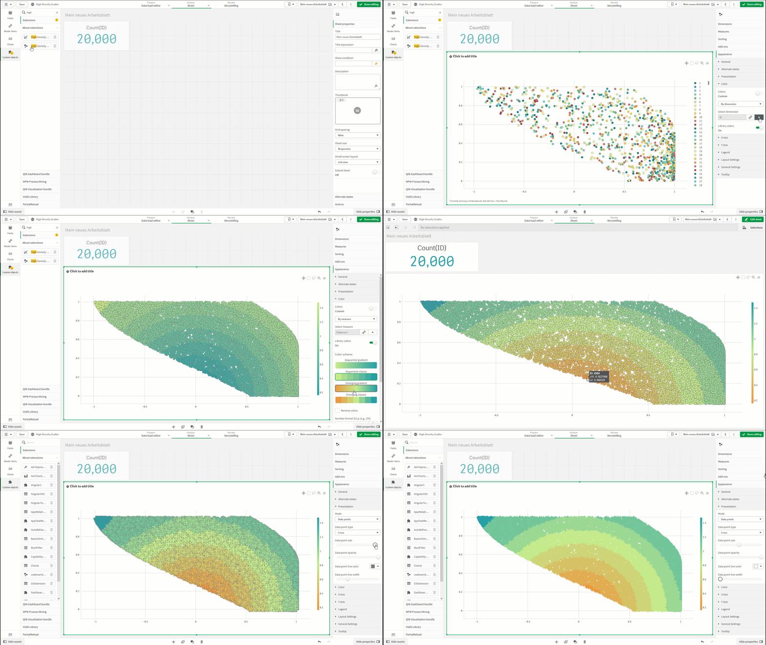
With this Qlik Sense extension a high-density scatter plot with several tousands data points can be created.
The extension is based on https://plotly.com/javascript/. The library supports WebGL for rendering.
Tips for configuration:
Add-Ons > "Max Records": Default 5000. Increase the number to see more points in the chart.
Add-Ons > "Reference lines": Add line here. The line geometry expects a set of coordinates. e.g. [x1, y1],[x2, y2] creates a straight line. Further examples are in the attached Qlik Sense app.
X Axis/Y Axis > "Tick Label Format-D3.js": Defines the date format for the acix. D3 formats are used. e.g. "YYYY-MM-DD hh:mm" > D3: "%Y-%d-%m %H:%M" e.g. "#,##0.00" > ",.2f" Date Format: /~https://github.com/d3/d3-time-format Number Format: /~https://github.com/d3/d3-format/blob/master/README.md#locale_format
Dimensional Lines:
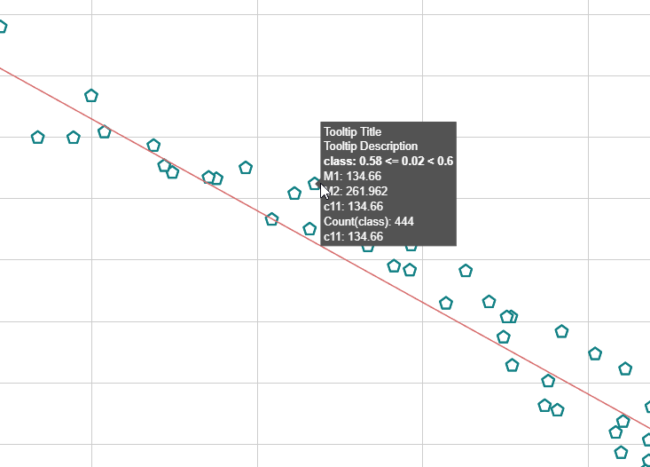
e.g. Regression, Median
Tooltip:
Experimental: Max Performance Mode
Known Limitations:
- The extension is tested with ~100k data points.
- Number formats in the measures are ignored. Use Tick Format in the X Axis/Y Axis configuration instead.
- No support for colors in Master measures and dimensions.
- No support for selections on axis and legend.
- Printing of the high-density scatter should work up to 50k points (only QSE Windows).
- Extension tested with Sep2020/Nov2020/Feb2021/May2021 release
- New versions of the extension may require that existing objects need to be replaced
Release:
-
2021-06-28
- Upgrade Plotly 2.0
- Bugfix: Handling null values in trace and tooltip
- Bugfix: line chart increase qInitialDataFetch (Width): 20
-
2021-08-07:
- FiX Date conversion
- Upgrade Plotly 2.2
-
2021-08-26:
- Custom color palette for color by dimension
-
2021-12-23:
- Upgrade Plotly 2.8.3

