

-orange.svg)

A React Native Calendar for Mendix Native (with Dark Mode Support)
You can track current status and add feature requests on the Github Project Board
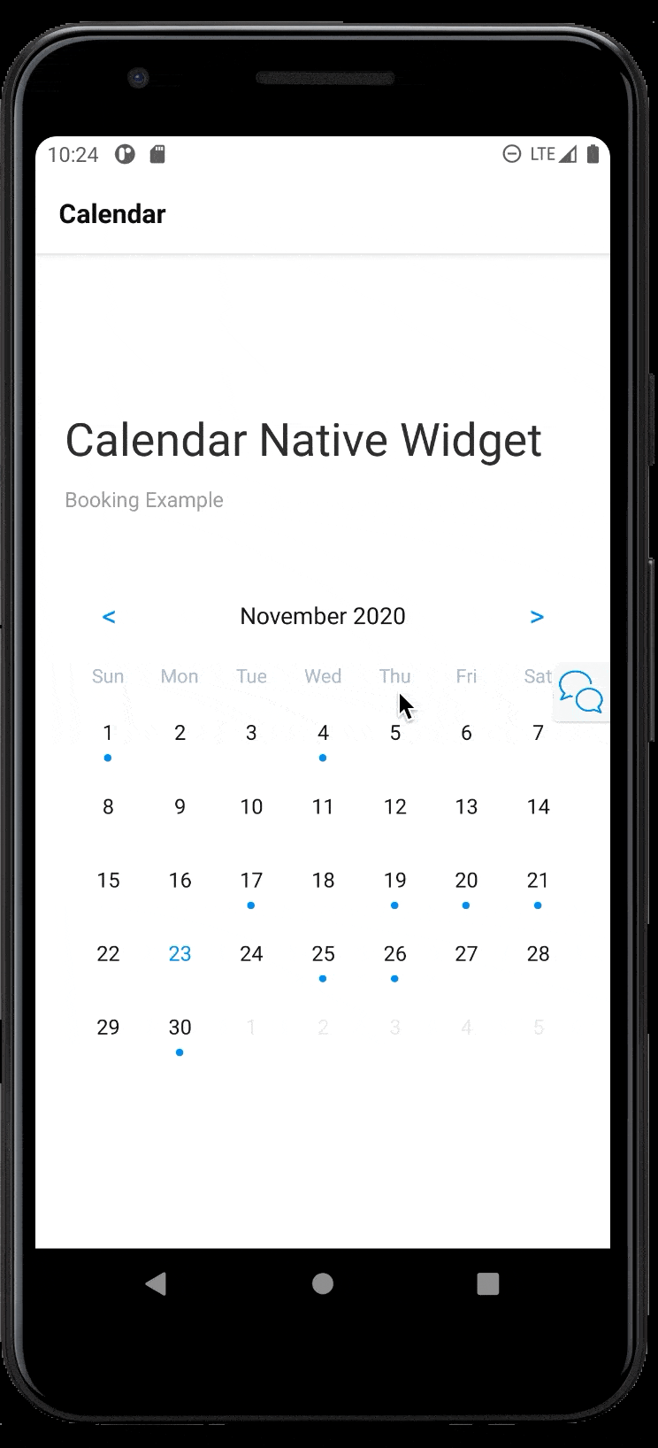
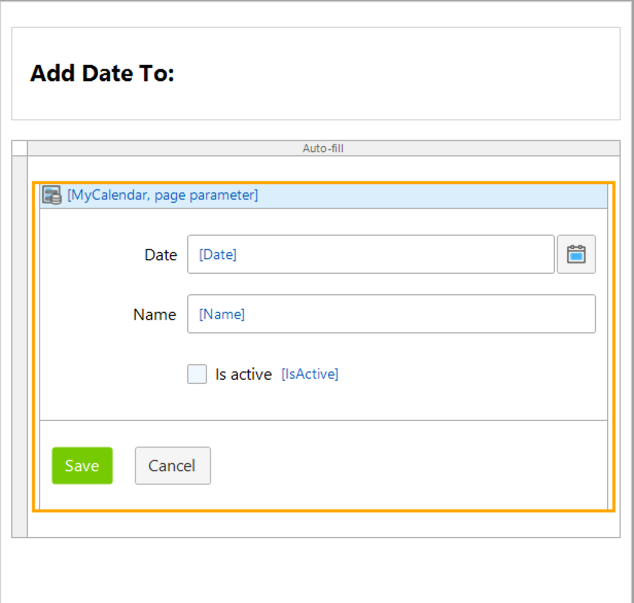
Add a Date
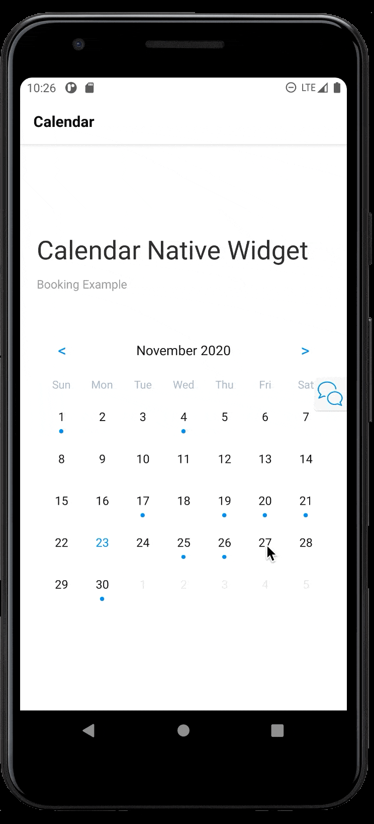
Swipe Down for More
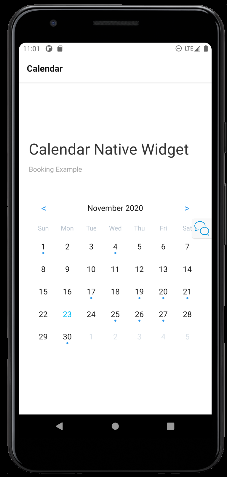
Display Modes
Light
Dark
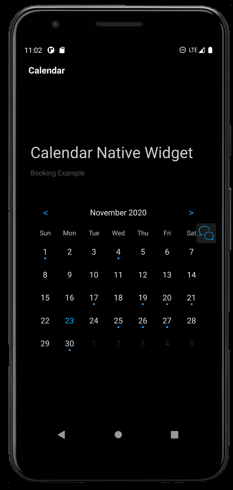 In its current form the Calendar put most of the Power in the Mendix Developers hands. The Widget tries to be a Minimal as possible while staying powerful.
The Idea at a higher level :
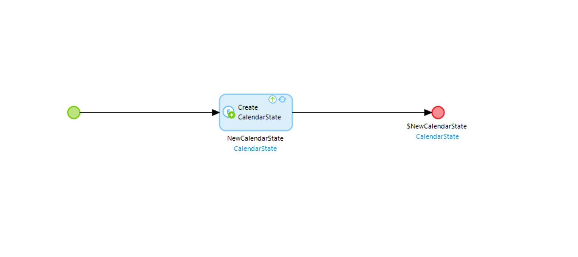
- You provide the widget with a list data source and specify the Date Entity.
- You wrap the Widget in a data source that is ideally Volatile/Non Persistable. This value will be consumed by the Widget and changed/manipulated. (Think of this like Redux/Mobx state)
- Pass the OnClick Option a Nano flow with the Parameter. This parameter will be the altered value (The date the user Pressed on) You as Mendix Dev can then deicide what to do with it.
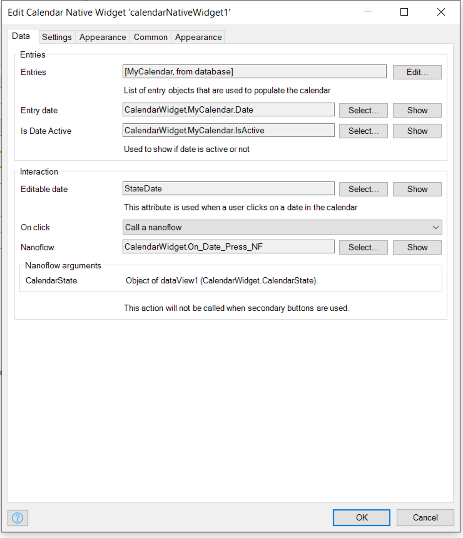
| Type | Info | |
|---|---|---|
| Incoming Dates | Data Source | List of Dates to Display |
| Date | DateTime | Attribute in Date Source that is of Type Date |
| Is Active Date | Boolean | If false the date will be greyed (Coming from data Model) |
| Volatile Date | DateTime | Non Persistable Date that the Widget can Change and Mendix Developer can Observe |
| OnClick | Action | Action to Happen when the User Clicks on the Date - Usually a Nano Flow used to Open Page to either Add New Date or Display all entries for selected date. |

| Type | Info | |
|---|---|---|
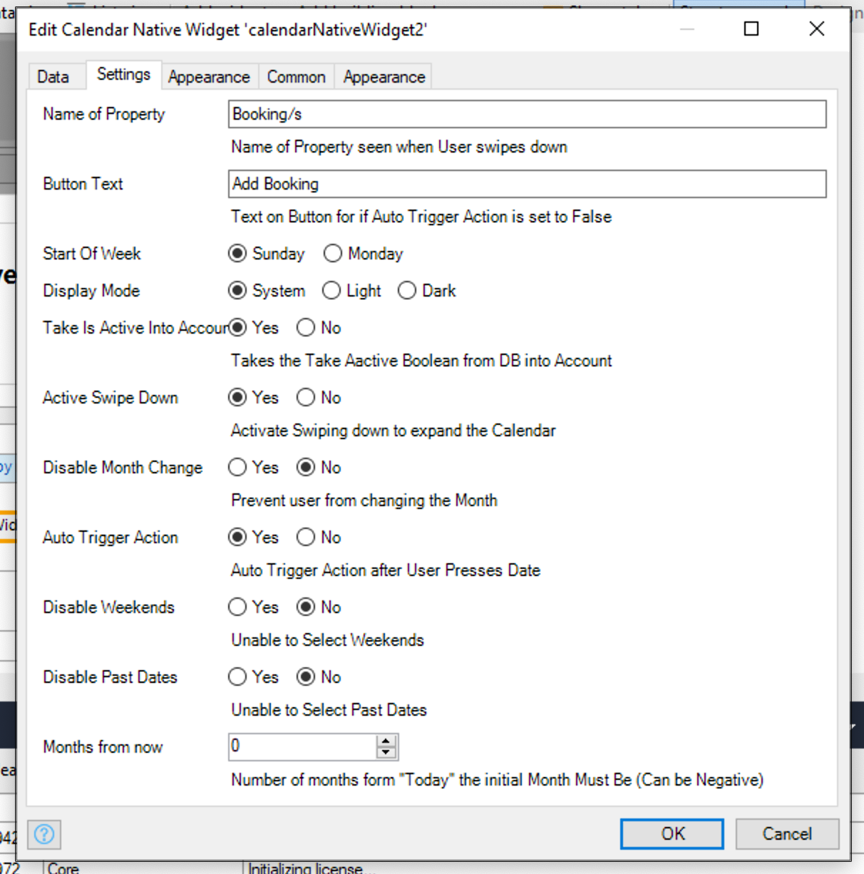
| Name of Property | String | Name of Property seen when User swipes down If Activate Swipe Down is True/Yes |
| Button Text | String | Text on Button If Auto Trigger Action is set to False/No |
| Take Is Active Into Account | Boolean | If false Is Active Date will be ignored |
| Start Of Week | ENUM | On what day is the start of the week |
| Display Mode | ENUM | Changes the Calendar "theme", based on what display mode the users device is on Either System (will take what the current device is on), or Light or Dark. |
| Active Swipe Down | Boolean | Activate Swiping down to expand the Calendar - Users will see an count of Calendar entries |
| Disable Month Change | Boolean | Prevent user from changing the Month |
| Auto Trigger Action | Boolean | Adds a button to the bottom of Calender, Allows user to select dat without triggering onClick action |
| Disable Weekends | Boolean | Prevents user from selecting Weekends |
| Disable Past Dates | Boolean | Prevents user from selecting dates in the Past |
| Months from now | Integer | Positive or Negative Integer. sets the default starting month from Today. |
| Type | Info | |
|---|---|---|
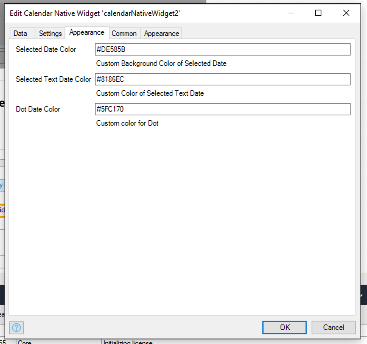
| Selected Date Color | String | Custom Background Color of Selected Date |
| Selected Text Date Color | String | Custom Color of Selected Text Date |
| Dot Date Color | String | Custom color for Dot |
Add Date Page
On Press Date
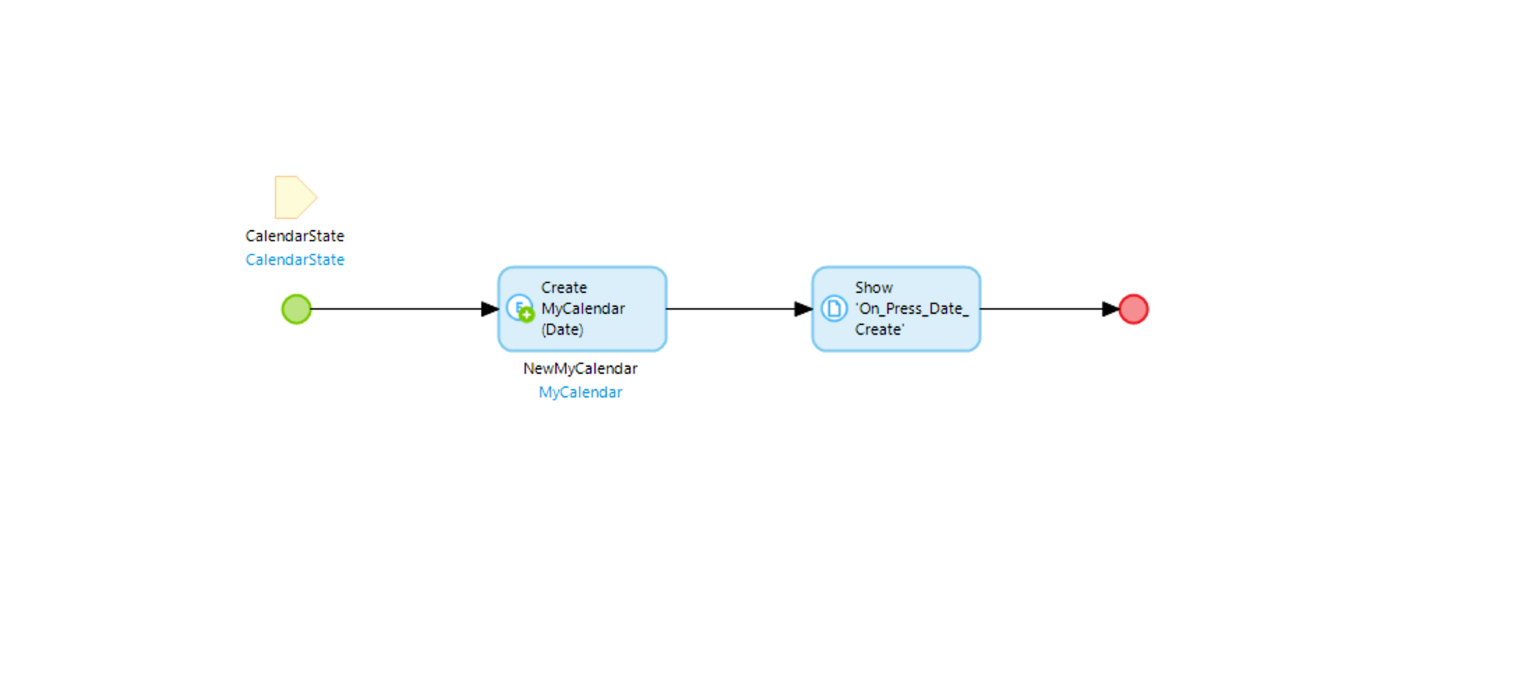
Create State